|
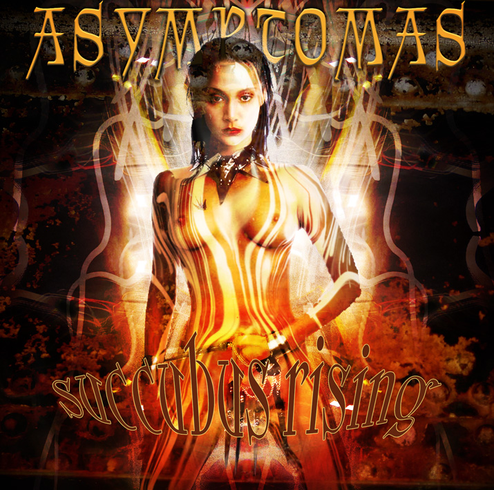 |
You wouldn't believe the amount of black/doom/death/grind/etc. metal albums we got at the used CD store I worked at years ago: One of my co-workers knew many people in the T.O. metal scene, and they discovered that we were receptive to the volumes of metal they wanted to get rid of. This meant I got to see literally hundreds of metal CD covers some weeks. Some of them were really, really interesting. And then, there were the tonnes of them that were just completely stoopid, juvenile, offensive-for-the-sake-of-being-offensive, poorly executed, poorly rendered, poorly chosen, etc. I guess the above was an attempt to take some of the common elements I saw in those covers (and respect for women isn't one of the things one sees much of, frankly), and doing something cool with them. All of the image sources were taken by myself, or my wife with a digital camera: long-exposure shots of cars/buses passing, crusty iron bridge supports, etc.... The image of the model was found via Usenet... And you gotta trust me: before I shrunk this down to a web-friendly size, then compressed it as a .jpg, the title lettering looked great. |
|
| Total images: 12 | Help | |